When it comes to writing the perfect resume, most people rarely put much thought into which font to use.
As the CEO of a resume writing company, I review thousands of resumes every year. It’s also part of my job to speak with hiring managers and recruiters to understand what they look for in candidates today — and many of them agree: Choosing a readable font is important.
In fact, the average initial screening time for a candidate’s resume is just 7.4 seconds, according to a study from job search website The Ladders.
The “best resumes” — where recruiters spent the most time and focus — had “clearly marked section and title headers, all written in a clear font,” the study noted.
The best fonts for your resume
The top factors to consider when picking a font are professionalism, design, spacing and, most important of all, readability.
Also, many companies use an ATS (applicant tracking system) to streamline the recruiting process, and there may be problems if the system doesn’t recognize your font. So if you’ve been using something too unique or unusual, it’s time to update your resume font.
Here are my seven favorite picks for 2021 to 2022:
1. Arial
This sans-serif font is often used for branding and website or mobile design, which makes it a great option if you’re in the creative field or are applying to a marketing job.

2. Georgia
Georgia is very similar to the Times New Roman font, except a bit wider. Many people also find it easier to read, which is why The New York Times uses it as its main font.

3. Helvetica
Helvetica is generally seen as more elegant and modern. Go with this font if you want to add some flair to your resume while maintaining the same level of professionalism as some of the traditional fonts.

4. Tahoma
A more narrow body structure compared to some of the other fonts on this list, Tahoma has a technical feel, making it an ideal option for those in the software engineering field.

5. Times New Roman
This is still my No. 1 favorite. Still one of the most popular fonts used today, Times New Roman is traditional, classic and easily recognizable.

6. Trebuchet MS
Trebuchet MS has a thicker look, but its rounded san-serif typeface makes it great for entry-level job seekers trying to fill up a single-page resume with their experience, skills and accomplishments.

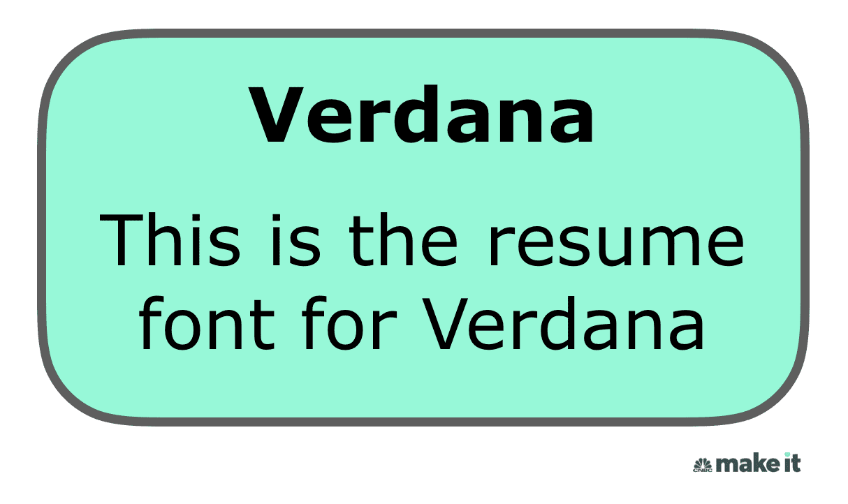
7. Verdana
Need to squeeze in more text on your resume? Go with Verdana, as it was designed to be easy to read in small print on computer screens.

The font size matters, too
If your font is too small, hiring managers will have to squint to read your resume. If it’s too large, your resume will look bulky and end up being longer than it needs to be.
To avoid making any mistakes when it comes to font sizes and formatting, here are my three general rules:
- Your name (at the top): 18 to 24 points
- Headings: 12 to 16 points
- Body: 10 to 12 points
You can always utilize font sizes to manipulate the length of your resume. For example, if your resume is sitting at 1.5 pages when using 10-point font, consider increasing the font size to 12 points in order to get your resume closer to a full two pages.
Of course, it’s ultimately your experience and skills that will win over employers. But using a clear font in a size that makes sense will boost your chances of getting your resume the time and attention it deserves.
[“source=cnbc”]